
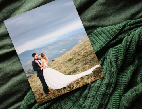
Essential Tips for Photographic and Fine Art Printing
Colour management workflow is fundamental to photographic and art practice, especially when it comes to bringing your creative visions to life in print. Getting consistent results between what you see on your screen and what is reproduced in your final prints is essential for any photographer.
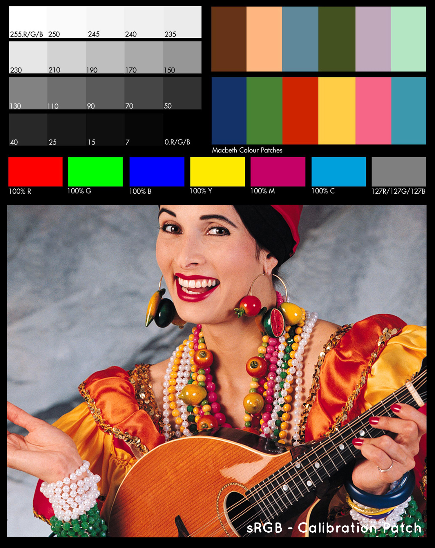
Once you have a file on your screen that you have printed through the lab, you’ll see how well it matches. At any point in time, you can request a Sample Pack which will have a sample of all our paper types and a printed copy of our calibration image. You can download the digital copy of this print here to compare your screen to our print.
Good colour management workflow ensures that your artwork meets the standards of a professional lab like Streets Imaging and our colour management systems (such as the professional profiling of our papers and printers and meticulous daily calibrations of our printers). What makes Pro Labs different to Consumer Labs is that as a default, we do not make changes to your image files to ensure what you see is what you get. To best achieve this, I’ll go over the equipment, practices, and considerations necessary to achieve an impeccable colour management workflow for your endeavours.
Invest in a high-quality desktop monitor
The foundation of colour management begins with selecting a high-quality desktop monitor. Things to look out for in your choice of monitor are:
- Colour Accuracy: Look for a monitor known for its colour accuracy and wide colour gamut.
- Resolution: Opt for a monitor with a high resolution to view your work with incredible detail.
- Calibration Capabilities: Ensure that your monitor allows for hardware calibration, which provides precise colour-matching capabilities.
- Size Matters: Consider the size of your monitor, keeping in mind your workspace’s dimensions. A larger screen can provide a more immersive experience but should still fit comfortably.
You can read more about the best monitors for photographers starting out here.
Regular calibration – Please don’t skip this one!
To maintain colour accuracy, you’ll need to calibrate your monitor at least once a month (depending on use). Without calibration, your monitor’s colour settings can drift over time, resulting in inconsistencies between what you see and what is printed. To achieve this:
- Invest in a Calibration Device: To calibrate your monitor – you’ll need to purchase a calibration device. They are simple to use and take only 5-10 minutes. We recommend the i1Pro. If you’re local to the lab you can hire ours for the day for $30 – just get in touch.
- Avoid Altering the Brightness: Resist the temptation to alter the brightness or contrast of your monitor! It can and will affect colour accuracy. Calibration tools aim to provide a balanced representation, and manual adjustments can undermine this process. This and automatic adjustments are the most common cause of complaints of prints coming back too dark or too washed out. This is also one of the main reasons we don’t recommend using a laptop monitor for processing and editing your images, as the angle of view can also change the screen’s appearance.
- Disable Automatic Adjustments: Some monitors have automatic brightness or contrast adjustments enabled by default. Disable these features and manually configure your monitor’s settings to ensure consistency.


Proper lighting conditions
For accurate colour management, you must control the lighting conditions in your workspace. Here are some things to consider:
- Ambient Light: Maintain consistent ambient lighting in your workspace. Avoid direct sunlight and harsh artificial lighting or furniture, clothing and walls with bold colours as they can distort the colours you see.
- Daylight Temperature: Use light sources with a daylight colour temperature (approximately 5500-6500K) to ensure the colours you see match the prints.
- Even Lighting: Ensure that the lighting in your workspace is evenly distributed to prevent shadows and uneven reflections on your prints.
Remember that a monitor has a built-in light source. Your print’s light source is the light around it and the quality of that light will change how you see the print. So for the best light for this purpose…
Use a dedicated light source for viewing prints
To evaluate your prints accurately, we recommend investing in a dedicated light source designed for this purpose. A lightbox or specialised viewing lamp like this Ilford Ilfolux with daylight-balanced lighting will help you assess your prints under the most consistent conditions.
Most importantly – do test prints, especially before large orders
Before committing to a significant print order, do some smaller test prints. This will allow you to fine-tune your colour management workflow and ensure your colours match your expectations. Adjust settings, profiles, and colours as needed to achieve the desired results. By taking this precaution, you can save time, and resources, and ensure your final prints meet your expectations.
Still finding some colours are different?
If you’ve got your colour management workflow set up as above and still find that some of your colours are not right, it could be that those colours are out of gamut. That means the colours in the image are out of range for that particular printing process. Fluorescent and super bright colours in the Adobe1998 space can be out of range for some printers. To mitigate this, it is important to soft-proof your images using the dedicated printer profile to see where it may occur and edit accordingly. Watch this space for our guide to soft-proofing your images or contact the lab staff if you have any questions.
Colour management is the foundation of producing high-quality prints that represent your artistic visions authentically. Remember: The equipment you use for processing is just as important as the camera you use for capturing. By investing in a few bits of top-notch equipment, calibrating your monitor regularly, controlling lighting conditions, using dedicated light sources for print viewing, and ordering test prints – you can ensure that what you see on your screen perfectly matches the output in your final prints. And remember, resist the urge to tamper with your monitor’s brightness!
If you’re new to Streets, we offer you a first test order of 4 8×10 in lustre prints or 1 8×10 in fine art print for free so you can see for yourself the colour reproduction, quality and delivery service we offer (includes shipping). Click here to find out more.
Essential Tips for Photographic and Fine Art Printing
Colour management workflow is fundamental to photographic and art practice, especially when it comes to bringing your creative visions to life in print. Getting consistent results between what you see on your screen and what is reproduced in your final prints is essential for any photographer.
Once you have a file on your screen that you have printed through the lab, you’ll see how well it matches. At any point in time, you can request a Sample Pack which will have a sample of all our paper types and a printed copy of our calibration image. You can download the digital copy of this print here to compare your screen to our print.
Good colour management workflow ensures that your artwork meets the standards of a professional lab like Streets Imaging and our colour management systems (such as the professional profiling of our papers and printers and meticulous daily calibrations of our printers). What makes Pro Labs different to Consumer Labs is that as a default, we do not make changes to your image files to ensure what you see is what you get. To best achieve this, I’ll go over the equipment, practices, and considerations necessary to achieve an impeccable colour management workflow for your endeavours.
Invest in a high-quality desktop monitor
The foundation of colour management begins with selecting a high-quality desktop monitor. Things to look out for in your choice of monitor are:
- Colour Accuracy: Look for a monitor known for its colour accuracy and wide colour gamut.
- Resolution: Opt for a monitor with a high resolution to view your work with incredible detail.
- Calibration Capabilities: Ensure that your monitor allows for hardware calibration, which provides precise colour-matching capabilities.
- Size Matters: Consider the size of your monitor, keeping in mind your workspace’s dimensions. A larger screen can provide a more immersive experience but should still fit comfortably.
You can read more about the best monitors for photographers starting out here.
Regular calibration – Please don’t skip this one!
To maintain colour accuracy, you’ll need to calibrate your monitor at least once a month (depending on use). Without calibration, your monitor’s colour settings can drift over time, resulting in inconsistencies between what you see and what is printed. To achieve this:
- Invest in a Calibration Device: To calibrate your monitor – you’ll need to purchase a calibration device. They are simple to use and take only 5-10 minutes. We recommend the i1Pro. If you’re local to the lab you can hire ours for the day for $30 – just get in touch.
- Avoid Altering the Brightness: Resist the temptation to alter the brightness or contrast of your monitor! It can and will affect colour accuracy. Calibration tools aim to provide a balanced representation, and manual adjustments can undermine this process. This and automatic adjustments are the most common cause of complaints of prints coming back too dark or too washed out. This is also one of the main reasons we don’t recommend using a laptop monitor for processing and editing your images, as the angle of view can also change the screen’s appearance.
- Disable Automatic Adjustments: Some monitors have automatic brightness or contrast adjustments enabled by default. Disable these features and manually configure your monitor’s settings to ensure consistency.
Proper lighting conditions
For accurate colour management, you must control the lighting conditions in your workspace. Here are some things to consider:
- Ambient Light: Maintain consistent ambient lighting in your workspace. Avoid direct sunlight and harsh artificial lighting or furniture, clothing and walls with bold colours as they can distort the colours you see.
- Daylight Temperature: Use light sources with a daylight colour temperature (approximately 5500-6500K) to ensure the colours you see match the prints.
- Even Lighting: Ensure that the lighting in your workspace is evenly distributed to prevent shadows and uneven reflections on your prints.
Remember that a monitor has a built-in light source. Your print’s light source is the light around it and the quality of that light will change how you see the print. So for the best light for this purpose…
Use a dedicated light source for viewing prints
To evaluate your prints accurately, we recommend investing in a dedicated light source designed for this purpose. A lightbox or specialised viewing lamp like this Ilford Ilfolux with daylight-balanced lighting will help you assess your prints under the most consistent conditions.
Most importantly – do test prints, especially before large orders
Before committing to a significant print order, do some smaller test prints. This will allow you to fine-tune your colour management workflow and ensure your colours match your expectations. Adjust settings, profiles, and colours as needed to achieve the desired results. By taking this precaution, you can save time, and resources, and ensure your final prints meet your expectations.
Still finding some colours are different?
If you’ve got your colour management workflow set up as above and still find that some of your colours are not right, it could be that those colours are out of gamut. That means the colours in the image are out of range for that particular printing process. Fluorescent and super bright colours in the Adobe1998 space can be out of range for some printers. To mitigate this, it is important to soft-proof your images using the dedicated printer profile to see where it may occur and edit accordingly. Watch this space for our guide to soft-proofing your images or contact the lab staff if you have any questions.
Colour management is the foundation of producing high-quality prints that represent your artistic visions authentically. Remember: The equipment you use for processing is just as important as the camera you use for capturing. By investing in a few bits of top-notch equipment, calibrating your monitor regularly, controlling lighting conditions, using dedicated light sources for print viewing, and ordering test prints – you can ensure that what you see on your screen perfectly matches the output in your final prints. And remember, resist the urge to tamper with your monitor’s brightness!
If you’re new to Streets, we offer you a first test order of 4 8×10 in lustre prints or 1 8×10 in fine art print for free so you can see for yourself the colour reproduction, quality and delivery service we offer (includes shipping). Click here to find out more.